Choosing the right font is a crucial aspect of website design and blog creation. Fonts contribute to readability, user experience, and the overall aesthetic of your site. The fonts you choose will play a significant role in how visitors perceive your brand. It does not matter if you’re running a personal blog, a professional website, or an online store.
Google Fonts is a free service that offers a wide range of high-quality web fonts. It has become the go-to source for many designers and bloggers. With hundreds of font families available, knowing which fonts are the best for your website is important.
You also need to learn how to use them effectively. This article will explore the best Google Fonts for websites and blogs. We will also explain how to select based on your site’s needs.
Why Choose Google Fonts for Your Blog or Website?
When starting a blog, choosing the right Google Fonts can enhance the visual appeal and readability of your content. This makes it easier to promote blog posts effectively. Integrating long-tail keywords into your articles can improve SEO. Using free stock images can make your blog visually engaging without extra costs. These elements combined can significantly boost your blogging efforts, attracting more readers and ensuring your blog stands out.
- Free and Open Source: Google Fonts are free to use for both personal and commercial projects. This is a major advantage, especially for bloggers or small businesses looking to minimize costs.
- Web-Optimized: Google Fonts are specifically designed for web use, meaning they load quickly and look good across all devices.
- SEO-Friendly: The fast loading speed of Google Fonts contributes to better website performance. This can have a positive impact on your SEO rankings.
- Cross-Browser Compatibility: Google Fonts work consistently across all modern browsers, ensuring that your website looks the same to all users.
- Easy Integration: You can easily add Google Fonts to your website by embedding a simple line of code. You can also use a plugin if you’re on WordPress.
Now, let’s dive into the psychology behind font selection. We will explore the top Google Fonts for blogs and websites. You will learn how to integrate them seamlessly into your design.
What Makes a Font Great for Websites and Blogs?
When selecting fonts for your blog or website, you need to consider several factors. The right font can enhance readability, improve user experience, and create a strong visual hierarchy. Here are the key criteria that make a font great for websites and blogs:
1. Readability
The primary purpose of any font is to convey written information clearly. For online content, readability is crucial because most users skim through content rather than reading word for word. Fonts that are too decorative or complex can create a cognitive barrier. These fonts make it harder for users to engage with your content.
2. Aesthetic Appeal
The font you choose should match the tone and style of your website. Whether your blog is professional, playful, or creative, the font can help set the mood. Pairing different fonts for headings and body text is also important. It helps to create contrast. This makes your content more visually appealing.
3. Fast Loading Times
Google Fonts are optimized for the web. They load quickly. However, you should still avoid using too many different fonts on one page. Overloading your site with fonts can slow down your page, affecting user experience and SEO.
4. Compatibility Across Devices
In today’s mobile-first world, your font needs to look good on all screen sizes. Google Fonts are designed to work across a variety of devices. This ensures that your text remains legible whether it’s viewed on a smartphone, tablet, or desktop.
5. Versatility
A versatile font works well in different sizes and weights. For example, some fonts look great in large headlines but are difficult to read in smaller body text. Choose fonts that have multiple weights and styles (bold, italic, light, etc.) to ensure flexibility across your site.
Top 10 Best Google Fonts for Websites and Blogs
Most of the websites use these best Google fonts. Here is a list of the best Google fonts on different popular websites.
1. Roboto

- Type: Sans Serif
- Best For: Tech, corporate, and professional blogs
Roboto is one of the most popular Google Fonts for its clean, modern look. It strikes the perfect balance between geometric precision and friendly curves, making it highly readable. This font is versatile enough to be used in both body text and headings. This is why many websites, including tech blogs and corporate sites, favor Roboto.
Why Use Roboto?
- Highly legible at any size.
- Modern, clean design that works well for tech-related content.
- Wide range of font weights (thin to black), giving you flexibility in your design.
2. Open Sans
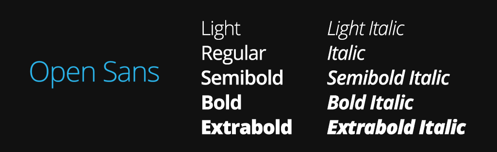
- Type: Sans Serif
- Best For: General blog content, multi-niche blogs
Open Sans is another highly popular Google Font, praised for its simplicity and neutrality. Its clean, modern look makes it suitable for a wide variety of websites, from personal blogs to professional business sites. It’s optimized for both print and web, ensuring excellent readability on all devices.
Why Use Open Sans?
- Easy to read, even at smaller sizes.
- Excellent for long-form content due to its clarity.
- Works well in different contexts, making it a versatile choice.
3. Lato
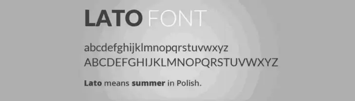
- Type: Sans Serif
- Best For: Personal, lifestyle, or creative blogs
Lato has a friendly, modern feel with a slightly rounded design. It’s perfect for blogs with a more personal or creative touch. The font is popular for body text. It remains clear and easy to read. It also adds a hint of personality.
Why Use Lato?
- Combines professionalism with warmth.
- Great for personal blogs, lifestyle websites, and creative projects.
- Comes in a wide range of weights, from hairline to bold.
4. Merriweather

- Type: Serif
- Best For: Long-form content, editorial, or academic blogs
Merriweather is a serif font designed specifically for readability on screens. Its slightly condensed letterforms make it ideal for long-form content, such as blogs or academic articles. If you want to give your blog a more traditional or editorial feel, Merriweather is a great option.
Why Use Merriweather?
- Optimized for screen readability.
- Adds a touch of elegance and formality to your content.
- Perfect for academic or educational blogs.
5. Montserrat

- Type: Sans Serif
- Best For: Headings, fashion, lifestyle, and design blogs
Montserrat is a bold, eye-catching font that works well in large sizes. It’s ideal for headings, titles, or logos, especially on fashion, lifestyle, or design blogs. The font was inspired by the urban typography of the Montserrat neighborhood in Buenos Aires. This gives it a modern, trendy look.
Why Use Montserrat?
- Bold and modern, perfect for headings.
- Adds a trendy, urban feel to your website.
- Works well in fashion or lifestyle blogs that need strong visual appeal.
6. Playfair Display
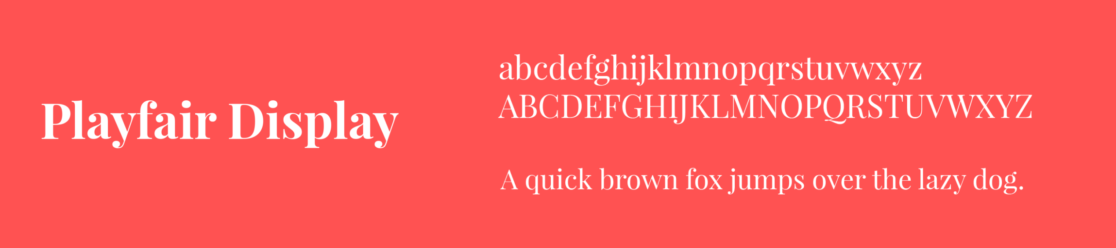
- Type: Serif
- Best For: Headlines, luxury, fashion, or beauty blogs
Playfair Display is a serif font with a high-contrast design, making it ideal for headlines and large text. It adds a sense of elegance and sophistication, making it a popular choice for luxury, fashion, or beauty blogs. Pair it with a clean sans-serif font for a balanced, professional look.
Why Use Playfair Display?
- Elegant and sophisticated, perfect for luxury brands.
- Great for headlines or titles.
- Pairs well with simple sans-serif fonts like Lato or Roboto.
7. Nunito
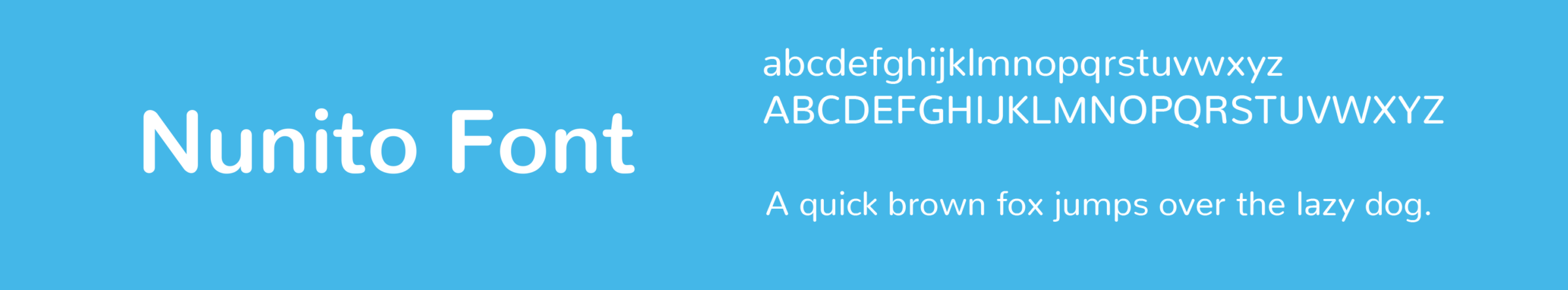
- Type: Sans Serif
- Best For: Personal, food, and creative blogs
Nunito is a rounded sans-serif font that gives a friendly and approachable vibe. It’s perfect for blogs that want to create a warm, welcoming atmosphere, such as personal, food, or creative blogs. Nunito works well for both headings and body text, offering versatility across your design.
Why Use Nunito?
- Rounded, friendly design that feels approachable.
- Works well for both headings and body text.
- Ideal for blogs that aim to build a personal connection with readers.
8. Poppins

- Type: Sans Serif
- Best For: Modern blogs, business, and creative blogs
Poppins is a geometric sans-serif font with a bold and balanced design. It’s perfect for blogs that want to create a modern, minimalist look. The font is highly versatile and works well for headings, subheadings, and body text. Its clean lines and sharp edges make it a great fit for business or tech blogs.
Why Use Poppins?
- Bold and geometric, giving a modern look.
- Works well for both headings and body text.
- Suitable for tech, business, and creative blogs.
9. Raleway
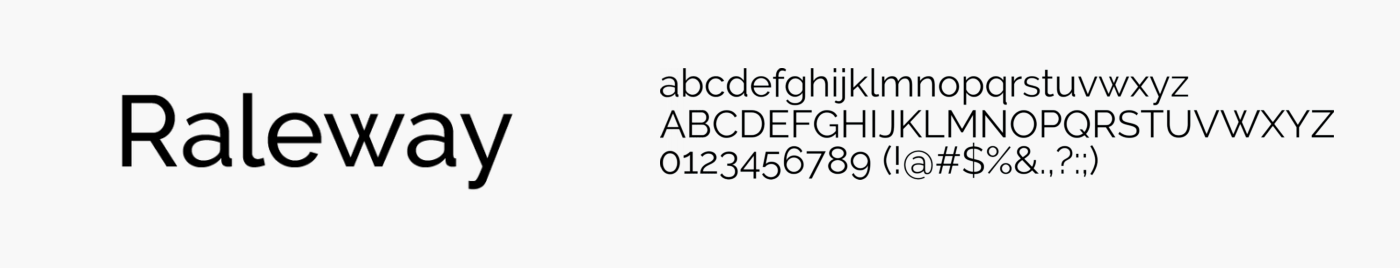
- Type: Sans Serif
- Best For: Design, fashion, or portfolio blogs
Raleway is an elegant, thin sans-serif font that works well for headlines and short blocks of text. It’s ideal for design, fashion, or portfolio blogs where aesthetics play a big role. Raleway gives your site a sophisticated and minimalist feel. However, it’s not ideal for long-body text. This is due to its thin letter forms.
Why Use Raleway?
- Elegant, minimalist design.
- Best for headlines and short text.
- Works well in design-focused blogs or portfolios.
10. Oswald

- Type: Sans Serif
- Best For: Magazine-style blogs, news, or sports blogs
Oswald is a reworking of the classic gothic typeface style, optimized for web use. Its condensed design makes it perfect for headlines, titles, or short, impactful text. Oswald adds a sense of urgency and boldness to your blog, making it ideal for news, sports, or magazine-style blogs.
Why Use Oswald?
- Bold and condensed, ideal for headlines and impactful text.
- Adds a sense of urgency and boldness to your content.
- Perfect for magazine-style blogs, news sites, and sports blogs.
Where can I get these best blog fonts from?
You can get high-quality fonts for your blog from several reliable sources. These platforms offer a wide variety of fonts, including web-safe, free, and premium options.
1. Google Fonts

- Why It’s Great: Google Fonts is one of the most popular and widely used sources for free fonts. The fonts are optimized for the web, load quickly, and are compatible with most browsers and devices.
- Features:
- Free to use for both personal and commercial projects.
- Easy integration with websites via a simple embed code or CSS import.
- Huge collection of fonts with helpful pairing suggestions.
- Best for: Bloggers looking for fast, reliable fonts that are SEO-friendly.
- Website: Google Fonts
2. Adobe Fonts (Formerly Typekit)
- Why It’s Great: Adobe Fonts offers a vast library of high-quality fonts, including both standard and premium options. It integrates with Adobe Creative Cloud, making it ideal for designers and creators who use Adobe products.
- Features:
- Access to premium fonts with an Adobe subscription.
- Seamless integration with websites and Adobe apps.
- No need to worry about licensing issues.
- Best for: Bloggers with an Adobe Creative Cloud subscription looking for exclusive, premium fonts.
- Website: Adobe Fonts
3. Font Squirrel

- Why It’s Great: Font Squirrel offers a wide selection of hand-picked, free fonts that are 100% legal for commercial use. They focus on high-quality fonts, and many of the options are web-optimized.
- Features:
- All fonts are free for commercial use.
- Easy-to-use webfont generator for custom fonts.
- Font identification tool.
- Best for: Bloggers who need free fonts with commercial licenses.
- Website: Font Squirrel
4. DaFont

- Why It’s Great: DaFont is a massive archive of free and paid fonts, covering almost every style you can imagine. It’s great for finding unique, decorative, or creative fonts for special purposes.
- Features:
- Free fonts, though some may require permission for commercial use.
- The large variety of decorative and artistic fonts.
- Easy download and installation process.
- Best for: Bloggers looking for unique, creative fonts for specific projects or titles.
- Website: DaFont
5. Fonts.com
- Why It’s Great: Fonts.com is a premium source for high-quality fonts, offering an extensive library of licensed fonts from renowned foundries. You can access a wide selection of fonts for web and print use.
- Features:
- Subscription-based with access to premium fonts.
- Fonts are well-optimized for web use.
- Free trial fonts are available with limited functionality.
- Best for: Bloggers seeking premium, professional fonts.
- Website: Fonts.com
6. MyFonts

- Why It’s Great: MyFonts has one of the largest collections of fonts. They offer both free and paid fonts. These come from independent designers and well-known foundries. Their platform also includes a font identification tool that helps you find fonts used on other websites.
- Features:
- Huge collection with many unique fonts.
- Includes web font licensing options.
- Font identification tool for discovering fonts in use.
- Best for: Bloggers looking for specific or premium fonts, including custom web fonts.
- Website: MyFonts
7. Creative Market
- Why It’s Great: Creative Market is a marketplace for independent designers to sell fonts, graphics, templates, and other digital assets. They offer a wide range of unique and trendy fonts that you not find on other sites.
- Features:
- A diverse collection of fonts from independent creators.
- Weekly free fonts are available with their newsletter.
- Fonts come with various licensing options.
- Best for: Bloggers who want trendy, independent, and custom fonts.
- Website: Creative Market
8. Google Web Fonts Helper
- Why It’s Great: This tool provides a fast and easy way to self-host Google Fonts on your blog. This can improve your website’s loading speed. It also gives you more control over the fonts.
- Features:
- Simplifies self-hosting of Google Fonts.
- Faster loading times compared to using Google Fonts’ CDN.
- Easy to use, with detailed instructions for embedding fonts.
- Best for: Bloggers who want to optimize loading speed while using Google Fonts.
- Website: Google Web Fonts Helper
9. Fontspring
- Why It’s Great: Fontspring offers a carefully curated collection of fonts with simple and clear licensing. They also provide a web font generator for custom fonts.
- Features:
- Clear, easy-to-understand licenses for fonts.
- Fonts optimized for web use.
- Great customer support and font pairing suggestions.
- Best for: Bloggers who want easy-to-understand licensing and high-quality fonts.
- Website: Fontspring
These platforms will give you access to the best fonts for your blog. You can choose from free, premium, or custom options.
How to find a font for another website?
To find the font used on another website, you can follow these steps:
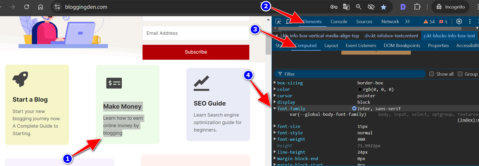
1. Using Browser Developer Tools
Most modern web browsers have built-in developer tools that allow you to inspect a website’s code, including the fonts used.
Steps:
- Right-click anywhere on the website. Then select Inspect (or press Ctrl + Shift + I / Cmd + Option + I on your keyboard).
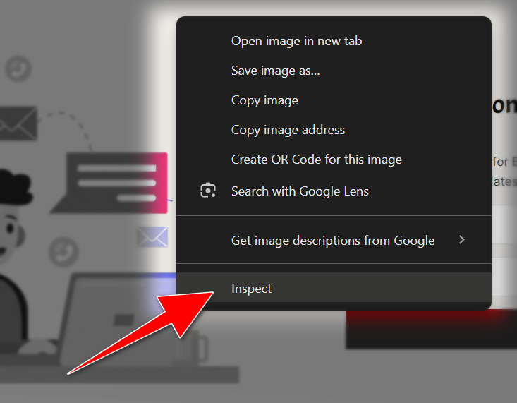
- In the Developer Tools window, click on the Elements tab.
- Hover over or select the specific text element whose font you want to identify.
- On the right side, under the Styles or Computed tab, you’ll see the CSS properties. These include font-family, which shows the font name.
2. Using Online Font Checkers
There are online tools that can detect fonts by analyzing a website’s code. Here are a few popular ones:
a. WhatFont (Browser Extension)
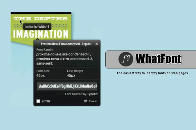
The “WhatFont” extension for Chrome is a popular tool among web developers and designers. It allows users to easily identify fonts on web pages by simply hovering over the text. Key features include:
- Font Identification: Hover over any text on a webpage to instantly discover the font family and size. You can also find out the line height, color, and other typographic details.
- Character Recognition: It supports detecting fonts within dynamic web elements like text inside images or in canvas elements.
- Customization: Users can customize the extension’s behavior, such as the color and size of the font detection popup.
- Accessibility: The extension provides quick insights into typography choices without needing to inspect elements through browser developer tools.
It’s a handy tool for anyone working with web typography. It offers a straightforward way to find fonts used across different websites. It also helps to identify them.
b. Fontface Ninja (Browser Extension)
The “Fonts Ninja” extension for Chrome is a comprehensive tool designed for web designers and developers. Similar to WhatFont, it allows you to hover and identify fonts. Here are some key features of Fonts Ninja:
- Font Detection: Allows users to identify fonts used on any website by simply hovering over the text. It provides details such as font family, size, weight, and color.
- Character Recognition: Capable of detecting fonts used within images, PDFs, and other non-standard web elements.
- Typography Insights: Provides a detailed analysis of typography styles across different elements of a webpage, including headings, paragraphs, and links.
- Font Pairing Suggestions: Offers recommendations for font pairings based on the fonts detected on the current webpage. This helps users create harmonious typographic designs.
- Quick Access: Users can quickly access and download identified fonts directly from the extension interface.
Fonts Ninja is known for its user-friendly interface. It has extensive features that assist in font exploration and selection for web projects. It’s particularly useful for those looking to enhance their understanding and use of typography in web design.
c. WhatTheFont
The “What The Font” extension for Chrome is a tool. It helps users identify fonts used in text elements on web pages. You can upload a screenshot of the text and the tool will identify the font. Here are some key details about the extension:
- Font Identification: Users can hover over text on any webpage. They can instantly discover the font family, size, weight, and color used.
- Detailed Information: Provides comprehensive details about typography elements. It includes line height and letter spacing. These are in addition to basic font attributes.
- Accessibility: Provides a quick and convenient way to identify fonts. It allows analysis without needing to inspect individual elements using browser developer tools.
- User Interface: The extension has a simple and intuitive interface. It is easy to use for both casual users. Professionals working with web typography also find it convenient.
- Customization: Allows some customization options, such as adjusting the appearance of the font detection popup to suit personal preferences.
“What The Font” is a useful tool for anyone interested in identifying typography choices on websites. It helps in understanding these choices. This tool provides insights that can aid in design inspiration. It can also assist in troubleshooting font-related issues.
3. Checking the Website’s CSS
- Open the Developer Tools (as in step 1) and look for the Sources or Network tab.
- Filter the resources to only see CSS files. Look for fonts defined in those files, especially under @font-face declarations. These often include the font name or reference to a font service like Google Fonts.
By using these methods, you can quickly identify the font used on most websites.
How to Choose the Right Google Font for Your Website or Blog
Selecting the perfect font for your website or blog is more than just picking something that looks nice. You need to take into account several key factors that will influence how your readers interact with your content.
Choosing the right fonts for your blog is essential for both readability and conveying the right tone to your audience.
Here’s a step-by-step guide to help you select the perfect fonts for your blog:
1. Consider Your Blog’s Niche and Audience
- Professional/Corporate Blogs: Choose clean, simple fonts like Serif (Georgia, Times New Roman) or Sans Serif (Helvetica, Arial) that communicate professionalism.
- Creative/Personal Blogs: You can use more unique or decorative fonts to reflect your personality or creative content. For example, handwritten or script fonts can work well for lifestyle, fashion, or photography blogs.
- Tech/Modern Blogs: Go for sleek, modern fonts like Roboto or Montserrat to give your blog a contemporary feel.
2. Ensure Readability
- Body Text: For long articles, choose fonts that are easy to read at smaller sizes. Sans-serif fonts like Open Sans, Lato, or Roboto are widely used because they are clean and readable on digital screens.
- Headings and Subheadings: You can get more creative here, but avoid overly decorative fonts that may confuse readers. Choose bold or distinctive fonts to make headings stand out but still remain legible.
3. Limit the Number of Fonts
Using too many fonts can create visual clutter. A good rule of thumb is to stick with:
- 1-2 fonts: One for body text and one for headings.
- 3 fonts max: If you add a third font, use it for special purposes. Examples include quotes or CTAs (calls to action). Too many fonts can make your blog look disorganized.
4. Choose Fonts with Good Contrast
Your fonts should have enough contrast with the background color for easy readability. For example, dark fonts on a light background (black on white) work well. Light fonts on a dark background (white on black) can be used for emphasis or design appeal. However, be careful not to strain the reader’s eyes.
5. Font Pairing and Harmony
If you’re using more than one font, make sure they complement each other.
- A common practice is to pair a Serif font for headings with a sans-serif font for body text. For instance, pairing Merriweather (Serif) for headings with Lato (Sans Serif) for body text creates a balanced look.
- Google Fonts provides suggestions for font pairings, which can simplify this process.
6. Check the Font’s Performance on Multiple Devices
Make sure your fonts look good on desktops, tablets, and smartphones. Some fonts work well on large screens. They may not be as readable on smaller screens. Test your blog’s font choices across different devices.
7. Consider Loading Speed
Some fonts can slow down your website if they aren’t optimized. Choose web-optimized fonts (like Google Fonts), which are designed for fast loading. Avoid using too many external font files that can negatively affect your blog’s performance.
8. Stick with Web-Safe Fonts or Use a Reliable Font Service
Web-safe fonts (like Arial, Verdana, or Georgia) are widely supported across all browsers and devices. Alternatively, use a trusted font provider. You can try Google Fonts or Adobe Fonts to access a broad selection of well-optimized fonts for the web.
9. Reflect Your Brand’s Identity
Fonts play a significant role in branding. Ensure your font choice aligns with your brand’s tone:
- Playful brands: Opt for quirky or handwritten fonts.
- Serious, professional brands: Stick with classic, minimalist fonts.
- Modern brands: Choose clean, geometric fonts with a contemporary feel.
10. Test and Gather Feedback
After selecting your fonts, ask for feedback from friends or colleagues. A fresh pair of eyes can help you catch any potential issues with readability or design.
By following these guidelines, you’ll create a visually appealing and easy-to-read blog that resonates with your target audience.
How to Integrate Google Fonts into Your Website or Blog
Adding Google Fonts to your website or blog is a simple process, whether you’re working with WordPress, HTML, or CSS. Here are the steps to follow for each platform:
1. Adding Google Fonts to WordPress
If you’re using WordPress, you can add Google Fonts without needing to write code. You can use plugins. Alternatively, you can manually add the font to your theme.
Method 1: Using a Plugin
- Install a plugin like Google Fonts Typography or Easy Google Fonts from the WordPress Plugin Directory.
- Activate the plugin. Then go to the settings to choose the fonts you want to use for different elements. These include headings, body text, etc.
- Customize the font size, style, and weight directly through the plugin interface.
Method 2: Manual Integration
- Visit the Google Fonts website and select the font you want to use.
- Click on “Select this style” and copy the code snippet provided under the “Embed” section.
- Open your WordPress theme files (you’ll usually find this under Appearance > Theme Editor).
- In the header.php file, paste the Google Fonts link inside the <head> tag.
Finally, use CSS to apply the font to your site. For example:
body {
   font-family: 'Open Sans', sans-serif;
 }
2. Adding Google Fonts Using HTML
If you’re working directly with HTML, adding Google Fonts is equally simple:
- Go to Google Fonts and select the font you want.
- Copy the <link> tag provided under the “Embed” section.
Paste the link tag into the <head> section of your HTML file:
<head>

   <link href="https://fonts.googleapis.com/css2?family=Roboto:wght@400;700&display=swap" rel="stylesheet">

 </head>
Now, apply the font to specific HTML elements using CSS. For example:
<style>
   body {
     font-family: 'Roboto', sans-serif;
   }
 </style>
3. Adding Google Fonts Using CSS
If you’re working with CSS files, the process is almost identical:
- Copy the font’s @import URL from Google Fonts.
Paste the @import rule at the top of your CSS file:
@import url('https://fonts.googleapis.com/css2?family=Lato:wght@400;700&display=swap');Apply the font to your HTML elements:
body {
   font-family: 'Lato', sans-serif;
}
4. Best Practices for Google Fonts Integration
- Optimize for Speed: While Google Fonts are designed for web use, adding too many fonts can slow down your site. Using multiple weights can also have the same effect. Limit yourself to 2-3 fonts and reduce the number of weights you use.
Preload Critical Fonts: Preloading your most-used fonts can reduce load times. Add this code to your HTML file:
<link rel="preload" href="https://fonts.gstatic.com/s/roboto/v20/KFOkCnqEu92Fr1Mu51xIIzc.ttf" as="font" type="font/ttf" crossorigin="anonymous">
Use Fallback Fonts: Always include a fallback font (like Arial or sans-serif) in your CSS in case the Google Font doesn’t load:
body {
   font-family: 'Montserrat', 'Arial', sans-serif;
}
Font Pairing Ideas for a Professional Look
Font pairing is a design technique that combines two or more fonts to create visual harmony and enhance readability. It helps establish a hierarchy by distinguishing between different types of content, such as headings and body text.
Here are a few font pairing ideas using Google Fonts:
1. Playfair Display and Open Sans
Playfair Display for headings and Open Sans for body text create a classy and professional look. This combination works well for lifestyle, fashion, or editorial blogs that want to mix sophistication with readability.
2. Montserrat and Roboto
Montserrat is bold and modern, making it perfect for headings, while Roboto is clean and neutral for body text. This pairing is ideal for tech blogs, startups, or creative portfolios.
3. Lato and Merriweather
Lato as a sans-serif font for headings and Merriweather as a serif font for body text provide a nice contrast. This combination is great for blogs that feature long-form content or academic articles.
4. Raleway and Nunito
Raleway for headings gives a minimalist, elegant touch, while Nunito is friendly and easy to read in body text. This pairing works well for personal or creative blogs.
5. Oswald and Lora
Oswald for titles paired with Lora. Lora is a serif font for body text. This is a strong combination of blogs with a magazine-like feel. This pairing is perfect for news, entertainment, or lifestyle blogs.
FAQs About the Best Google Fonts for Websites and Blogs
What are Google Fonts, and why should I use them for my blog?
Google Fonts is a free and open-source font library offered by Google. It features a wide range of font styles that are optimized for web use. They are easy to implement, load quickly, and are compatible across different devices and browsers. By using Google Fonts, you can improve your blog’s visual appeal and readability without compromising performance.
How many Google Fonts should I use on my website?
It’s best to limit your blog or website to 2-3 fonts. Use one for headings. Use another for body text. Optionally, use a third for special emphasis (such as in callouts or quotes). Using too many fonts can make your design look cluttered and may slow down your site’s load time.
How do I pair Google Fonts effectively?
To pair Google Fonts effectively, choose fonts that contrast yet complement each other. A common strategy is to combine a serif font for headings (e.g., Playfair Display) with a sans-serif font for body text (e.g., Open Sans). Ensure that the fonts have good visual contrast in size and weight, while maintaining overall readability.
Are Google Fonts mobile-friendly?
Yes, Google Fonts are designed to be responsive and work well across all devices, including mobile phones and tablets. However, it’s still a good practice to test your chosen fonts on different screen sizes. This helps to ensure that they maintain their readability and aesthetic appeal on mobile devices.
Do Google Fonts slow down my website?
Google Fonts are optimized for fast loading. However, if you use too many font styles and weights, it could increase your site’s load time. To avoid this, select only the styles and weights you need. Consider preloading critical fonts or using a font loading optimization tool to improve site speed.
Final words on Best Google fonts for websites or blogs
Choosing the best Google Fonts for your website or blog involves a balance of aesthetics, readability, and performance. Fonts like Roboto, Open Sans, and Lato are excellent choices for their readability and versatility. Fonts like Playfair Display, Montserrat, and Raleway can add character and personality to your headings.
When selecting fonts, always consider your blog’s niche, target audience, and overall user experience. A well-chosen font will enhance your content’s readability. It will also establish a professional, cohesive look that aligns with your brand.
As you explore font combinations and implement them on your site, keep in mind the importance of fast loading times. Also, consider cross-device compatibility. Google Fonts make it easy to integrate high-quality fonts into your website or blog. This helps ensure that your content stands out. It also remains accessible to your audience.
If you’re using the Kadence theme for your website, you’ll appreciate its seamless integration with Google Fonts. This feature enhances your site’s design and readability. By leveraging the flexibility of the Kadence Blocks plugin, you can easily customize your fonts. You can also adjust your layout for a unique look. Plus, if you’re looking to save, be sure to check out the Kadence WP discount. For those interested in more features, explore Kadence Pricing and the Kadence Lifetime bundle, which offer excellent value. Don’t forget to use the Kadence Conversions plugin to optimize your blog’s engagement and conversion rates. If you’re exploring other options, there are several great Kadence theme alternatives. These alternatives offer similar design flexibility and features. They help you create a visually appealing blog with ease.
The best fonts for your blog are the ones that make your content more engaging. They should also be readable and memorable. Experiment with different font pairings, test them across devices and enjoy the creative process of enhancing your blog’s design.


Great selection of Google Fonts! Choosing the right typography is crucial for enhancing readability and engagement on websites and blogs.
I can’t wait to try out some of these fonts in my own projects. Thanks for sharing these excellent recommendations!
Thanks for a marvelous posting! I quite enjoyed reading it, you are a great author.
Choosing a Blog font are very important.
This guide helped me to choose perfects fonts for my blogs.
I bookmarked your blog. Your blog design is very good.
have a nice day!
Thank you
Thanks for sharing…
Can you please share the font files so we can download.
Hello Madhav,
Everything is given in the article.