Color plays an important role in marketing and branding for web development. Different colors can evoke different emotions and reactions in people, so it’s important to choose the right colors for your brand or website. Colors can also influence people’s perceptions of a brand or website, so it’s important to choose colors that will create the right impression.
Some colors are more associated with certain emotions than others. For example, blue is often associated with trustworthiness and calmness, while red is often associated with excitement and energy. Choosing the right colors for your brand can help create the right emotional response in your target audience. Certain colors can also be more effective for certain types of brands or websites.
For example, bright colors may be more effective for a website targeting children, while more subdued colors may be more appropriate for a professional website. Choosing the right colors for your brand or website can help ensure that it is effective and appealing to your target audience.
Do you know why the hyperlink, or internet link, is blue? It is color psychology. The green and red colors cannot be distinguished or recognized by color-blind people, whereas most people can easily see the blue color. They say that Mark Zuckerberg is colorblind, so the color of the Facebook logo is blue. Today we will review some color theories and several tips to choose the best color for your website. It’s exciting, it’s an entire world to discover!
This is the first article that has been produced to help you comprehend color theory, select a palette for your ideal website, and increase conversions. The cornerstone of color psychology is “How Room Color Affects Mood.”
Table of Contents
How to choose the best color for the blog?
You can use color as a key element in many digital projects. When designing your website or blog, you think that you should not use the colors you like; you should use the colors that will influence the user to perform some action that you want him to do. Each color has a meaning. Not all colors mean the same to everyone, nor do they cause us the same impressions.
What is Color Psychology?
Color psychology is based on the mental and emotional effects that colors have on sighted individuals in many aspects of their lives. Color psychology includes some extremely subjective factors as well as other more acknowledged and confirmed elements. Keep in mind that there will be differences in interpretation, meaning, and perception among cultures.
Color psychology is a powerful tool utilized by artists, and interior designers, and as a marketing tool in a variety of businesses. Dali’s palette is what makes his artwork strange and emphasizes the hyperrealism he tries to convey.
According to Wikipedia,
Color psychology is the study of hues as a determinant of human behavior. Color influences perceptions that are not obvious, such as the taste of food. Colors can also work as placebos by having the color of pills be certain colors to influence how a person feels after taking them.
Through our eyes, we are able to sense colors, which then trigger emotional reactions in us such as memories of positive associations or rejection. They place more emphasis on personal experiences when determining how colors affect us.
For instance, the color red conjures up images of Christmas for us in December (positive). but we associate a firefighter with the fire in our home when we see one (negative).
Our moods can be affected by color. One of the key components of blogging and internet marketing is color psychology.
The basic principles of color psychology are:
- The color carries a specific meaning.
- The meaning of color is based on biologically innate meaning.
- According to the evolution process, color change forces color-motivated behavior.
- Color meaning and effect have to do with context as well.
Did you pass that feeling listless and prefer to wear clothing of cheerful color to lift your mood?
The Basics of Color Theory:
Wikipedia’s definition of (Color Theory Art Projects)
“Color theory is a set of basic rules in the mixture of color perception to achieve the desired effect by combining colors of light reflected or combining colors in pigments.” (or)
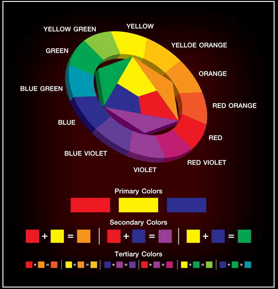
“Color theory” is a body of practical guidance on color mixing and the visual effects of a specific color combination. There are also definitions (or categories) of colors based on the color wheel: “primary color, secondary color, and tertiary color”.
According to Traditional Color Theory, the mixing of colored light,
Isaac Newton’s color wheel is often used to describe complementary colors, which are colors that cancel each other’s hue to produce an achromatic (white, gray, or black) light mixture.
The color theory is classified into three types.
Classification based on Color Theory
The principles of color theory first appeared in Leone Battista Alberti’s (1435) Writings and Leonardo da Vinci’s notebook in 1490. But the traditional color theory started in the 18th century. According to Color Theory Basics, the colors are divided into three major categories based on Color theories.
1. Primary colors:
Primary colors are considered unique (absolute) and cannot be created by mixing other colors. There are 3 types of primary colors.
- Classical: used by designers and painters, using blue, red, and yellow. May be obtained by mixing these colors with all other colors we know.
- The additive primaries (light) are another set of primary: red, green, and blue. Used in science or imaging monitors. If mixed in different proportions with other colors, and if they do form in equal amounts of white light.
- The subtractive primaries (pigment): It comprises magenta, yellow, and cyan. It uses them in printing.

2. Secondary colors:
Secondary colors are obtained by mixing equal parts of two primaries. They are orange, violet, and green.
3. Tertiary colors:
These colors are obtained by mixing primary with secondary colors. They are the Violet-Red, Orange-Red, Orange-Yellow, Yellow-Green, Blue-Green, and Violet-Blue. The colors can be subdivided into cold and warm.
- Cold: The colors range from The coldest are those that include in their mix any shade of blue. They evoke serenity, and tranquility, expressing loneliness, distance, and cold.
- Warm: The warm palette is they belong to yellow, red, and their derivatives. They usually have yellow and/or red combinations and are colors that express joy, dynamism, aggression, and strength and evoke heat, fire, and the sun.
How to Use Color Psychology on Your Blog?
- Color is a key factor to consider while working on multinational projects. If you choose colors based on your area or nation, the same colors may have alternative connotations in other places. Cultural variables have a significant impact on conversion outcomes.
- In Western culture, red means passion, love, and energy, but in Chinese culture, it represents good luck and celebration. It is linked with the Bolsheviks and Communism in Russia.
- The fuchsia is connected with females, whereas Belgium is related to children.
- Orange is another eye-catching color. While in the West it is connected with low-cost things and Halloween, in the Netherlands it is associated with the Dutch royal family and in Hinduism, it is regarded as a frightening hue.
What are the effects of colors on your blog?
In online marketing, web colors do more than just make a presentation; typically, they speak for the good or service, not with words but rather with sentiments and sensations. Which hue does one have greater online success? You are correct if you chose blue. Instagram, Facebook, Tumblr, Twitter, and LinkedIn are all extremely popular social networks on the internet. They all have a significant impact on the increase of online traffic, and as you can see, they are all that color. Why?
Why?
The color psychology on the web may have the following effects:
- Brand recognition increases by up to 80%.
- Increase reading by up to 40%.
- Accelerate learning between 55% and 78%
- Increased understanding by 73%
- Color ads are read up to 42% more often than ads in black and white.
Basic Colors and Examples
There are eight basic colors that are used for web designs and blog theme customizations. They are
Color 1: Blue Color
- It is the color of the sky and sea; it is the natural choice when we want things about it. Trees, mountains, and animals all out against a blue background are visible.
- Among the meanings associated with it are depth, loyalty, wisdom, calmness, and sincerity.
- They associate it with stability and depth; it is a cool color, emotionally linked to intelligence and consciousness.
Some Examples of the Internet
- Technological Products: Samsung, Mr. Clean
- Personal Care: Gillette, Philips, Nivea, Sensodyne
- Airlines, KLM, and Delta
- Water sports: Henley Royal Regatta
Color 2: Red
- It is a color that represents power, attraction, energy, and excitement.
- The color captures the user’s attention. It intensifies the metabolism of the body by being the color of passion, sensuality, and seduction.
- It is the strongest of all colors, the color of life, joy, strength, passion, value, and attractiveness.
- This color is like men and women in the same proportion.
The color is mostly using Marketing employees
- Using in beverage promotions: Coca-Cola, Estrella Damm
- Foods: KFC, Toki
- Ferrari dynamism
Color 3: Yellow
- This is the color of the gods—Sun, Light, and Heat of Summer—which is a positive color.
- They are associated with meanings such as fun, action, kindness, power, will, encouragement, strength, closeness, attraction, and affinity.
- But beware; it is a color that can also transmit negative emotions like anger, jealousy, lies, and envy.
- In Asia, yellow is the color of culture, gods, and rulers; happiness; glory; wisdom; and harmony.
- In China, its meaning transcends the dispensing life force, the majesty. It symbolizes sexuality, sour and bitter tastes, and refreshing.
Examples of sites on the web:
- Children’s market: Chupa Chups
- Advertising and Marketing: Ryan Keiser
Color 4: Violet
- They are the most unique, extravagant, and mysterious colors that exist.
- It provides the stability of blue and the energy of red. It symbolizes power, luxury, ambition, royalty, wealth, wisdom, creativity, independence, and dignity. The violet would be the favorite color for Cleopatra’s Egypt; the mysterious purple is associated with nobility and spirituality.
- It has a special, almost sacred nature: lavender, orchids, lilac, violets, and other flowers are often considered delicate and precious.
- The color of sinful sexuality, forbidden sex, uninhibited sex.
- A purple room boosts a child’s use of imagination and artistic creativity.
- Too purple could mean a bad mood. The bright purple is ideal for designs targeted at women’s colors.
The examples of this color used sites on the Web:
- It produces feelings of nostalgia and romanticism: Strawberry.net
Color 5: Orange
- Orange combines the energy of red with the happiness of yellow.
- associated with joy, the sunshine, and the tropics.
- It represents enthusiasm, happiness, attraction, creativity, determination, success, encouragement, and stimulation.
- It is a boiling color, so it produces a warm feeling.
- The orange color vision produces the sensation of more oxygen in the brain, producing an invigorating and stimulating mental activity effect.
- The Orange has very high visibility, so it is very useful to capture attention and highlight the most important aspects of a web page.
- It is a color that goes well with young people, so I highly recommend it to communicate with them.
- It is well suited to promoting food and toys. The reddish-orange evokes desire, sexual passion, pleasure, domination, aggression, and a desire for action.
Some of the examples on the web:
- It is widely used in web directories.
- Citrus colors are associated with healthy eating and stimulate appetite.
- The orange color makes an expensive product seem more accessible. Orange, indirect
Color 6: Green
- It is the color of nature and conveys ecological values; it is an ideology and a way of life.
- Symbolizing youth, loyalty, hope, and promise is the color of victory (crown of olive trees) and luck (clover), the color of the vegetarian world.
- It transmits tranquility (calm and quiet) and security.
- Green is the favorite color of 16% of men and 15% of women.
- It is versatile and enjoyable.
- It is a color that usually works without error.
Some of the examples on the web:
- For Healthcare: Piensaenverde
- Used skillfully by Heineken to convey the meaning of his philosophy.
- Synonymous with travel: Tripadvisor
Color 7: White
- The color purity is purer and more perfectly transmitted.
- It is the color of birth, resurrection, and peace.
- It has no negative connotations, being a positive, stimulating, bright, and delicate color that transmits chastity, innocence, and truth.
- The white symbolizes the other hand, clean.
- The buildings of hospitals are also white.
Some of the examples on the Web:
- The advertising world has been associated with freshness, giving it the meaning of learning funds and negative spaces in the design, usually to introduce new products and minimalist campaigns. Apple
8. Color: Black
- Color: Black indicates the absence of color.
- Without color, it is regarded as the symbolism and depth of the universe,
- the end of things.
- In the absence of light, and
- shadow and darkness.
- Next to violet are the colors of mystery and magic.
- It is a symbol of status, elegance, and sophistication.
- Young people are associating black cars with being fashionable and expensive.
- Its elegance and simplicity make it ideal for fashion campaigns.
Some of the examples on the web:
- It is very versatile and goes with everything.
- It is used by companies both traditional and modern. Nike
- The bright jewels and exclusivity: Cartier-Bvlgari
Online Color Pallet tools
There are many tools to choose your color palette, but do not want to be dizzy with these four tools can identify a color, find the colors that best combine with a photograph, or start defining your color palette.
I recommend these tools to learn more about color psychology, color theory, and color palettes:
- Find a color photo you want. Shutterstock Spectrum
- Want to be inspired by ideas for spectacular color palettes? Design-Seeds
Want to find out which colors have a picture to make an excellent combination?
Upload your photo and present the colors of your photo.
- IMGR Want to start defining your palette?
- Adobe Color is ideal for when you start, you can go on and on trying new combinations until you find yours. Adobe color
Try Color Mixing
Play and learn to combine colors:
As a bonus, I recommend this application for your mobile or tablet, which is highly addictive and is available for iOS and Android also. They base it on the Combinations of color palettes (if you order the colors properly). It’s a fun way to learn to feel the color and the different combinations you can make. This smart game helps to improve color mixing and choosing correct combination codes by using the above color theory to capture visitors’ attention. It will open your mind and give you ideas. You’ll have fun. Enjoy it
Final Words
Color Psychology is an important factor to attract and hold the users or visitors on the web 2.0 technology. Thousands of bloggers are using the Color theory to design attractive Themes or templates or web skins for their blogs/websites. Analyze the above-given blog and choose one good combination and color your blog and get huge success in the blogging field.
Do you have any experiences with the most effective colors to use in your web/blog? Share your experience with us below in the moments.


